Tuesday, 4 February 2014
Test Shot Analysis
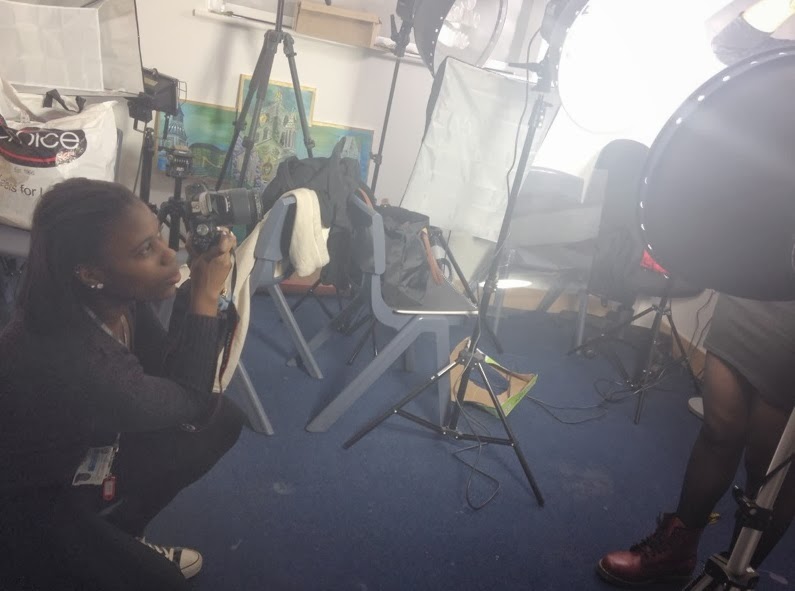
Today, I took some test shots of the model I want to use on my front cover. As I my model to do different poses, I took a lot of test shots at different angles to see which one I preferred more. To be honest, I preferred to do a mid shot rather than a long shot as I wanted more of a focus on the model so that readers can tell what genre my music magazine is. I used a bit of both, bright lighting and dim lighting as the lighting can relate to the indie pop genre, as most characteristics of the genre is timid, which could be connoted by the dim lighting. Aside from that the bright lighting could connote wildness and is quite quirky which also relates to the genre which I was going for. Having the studio for the mise-en-scene, I personally believed worked well as I knew how I wanted to place my model on photoshop and with the lighting not being too bright made me work with my model and photoshop a lot easier. Also I took a lot of high angle shots and low ones to create a sense of timid, but a quirky side to my model. This relates to the indie pop genre as most of the artists can be quite shy, but when they are on stage, their characteristics often change to bold and confident.
Subscribe to:
Post Comments (Atom)


No comments:
Post a Comment