Friday, 28 February 2014
Contents Page Colour Choices
Here is my contents page with colour. I have decided to use a lot of turquoise and burgundy as I have used these two colours on my front cover. I got feedback from my target audience and teachers and they told me that having my masthead for my front cover and contents page in turquoise, is a bit too much and an over flow. I decided to change the masthead for my contents page into burgundy for beneficial purposes of my target audience, as they obviously know what they look for when they are reading an indie pop music magazine. I also used the colour purple as it stands out for my headings. This will hopefully attract a wider audience as it is a bright and bold, happy colour.
Contents Page Image Choices


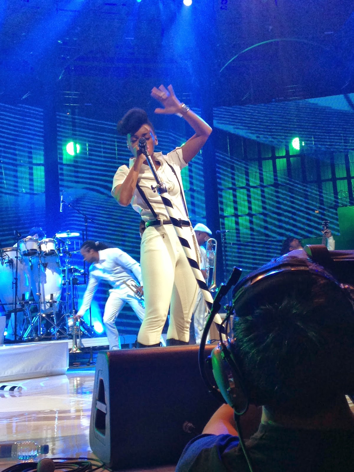
I was lucky enough to attend the iTunes Festival last year and saw Janelle Monae. Here are some pictures I took of the artist whilst she performed. As I am doing an Indie Pop magazine and Janelle Monae is an Indie Pop artist, I felt that it was a good idea to put one of my pictures as a feature on the contents page. When my teachers saw the picture I had taken of Janelle Monae singing into the microphone, they were so shocked that I got such a clear and professional picture. I showed them the other pictures I had taken and they advised me to use it as an even bigger feature because it had it as a small one before. But above is proof that the iTunes pictures were mine and I took them!
Contents Page Image Choices
Here are the images that feature on my contents page. As you can see, a lot of editing has been done to make my contents page look effective. The tartan skirt in the image above had to be cut around in order for it to be pasted into a feature box on the contents page. I done this using my magic wand tool on photoshop. I found this part quite easy. The only part I found hard was the top image on the left hand side, as I had to cut around my whole model in order for her to fit in one of the boxes. I also put some filters on her image to make it stand out more. I decided to choose my model, Jessica as she is into the Indie Pop genre and her personality relates to the indie pop genre. She is quite a shy girl, but when she sings, a different side of her comes out, a more bold and brighter person tends to shine through. This is symbolic with the Indie Pop artist, Ellie Goulding, as when she is not on stage, she is a timid person and gets embarrassed easily. When she's on stage, she is bold and confident. Also, Jessica's smile shows that she is hiding something, as she smiles forgetting about her shy past. Now she is confident.
Contents Page Layout
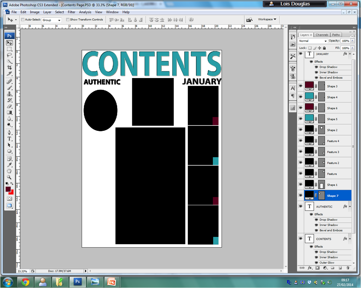
As you can see from the two images above, I have now started to create my contents page. I firstly thought about the layout according to my flatplan. From my flatplan, I have a lot of boxes which images will be inside them. My layout inspiration came from a magazine which Indie Pop artists feature in. This is beneficial as it relates to my brief according to what type of conventions a typically indie pop contents page which look like. I added the numbers from pages separately to make it look more realistic. For example, I would have the page number 10, then 13 beneath it because it is stereotypical for a music magazine. Plus the pages do not go up in order.
Tuesday, 18 February 2014
Monday, 17 February 2014
Front Cover Target Audience Feedback
As you can see from above, I created a visual audio video for my target audience feedback. I got a girl named Jhineil Wright who likes the Indie Pop genre which is beneficial to me as my brief is the indie pop genre. I asked her to give me her feedback on my music magazine suggesting what she likes about it and what she doesn't. In the beginning of the video, I asked her what she liked about the magazine from top to bottom and what she might change. She told me that she liked the use of the colour as it is bold and stands out. She also liked the fact that I used the name of the artist on the front cover in bold and that the colour is different to the masthead which creates great effect. However, Jhineil told me that she would change the fact that there were a lot of clear spaces where I have used a lot of white which I need to fill up. Apart from that it is a good magazine front cover.
Target Audience Feedback - Front Cover
Here I asked some people from my target audience to give me feedback on my music magazine. I asked these people as they enjoy reading Indie Pop magazines and that it the genre of music I'm hoping to achieve on my brief.
Natasha Chauhan: The front cover is very interesting and bold which I like. The image is clear and attractive. This looks so realistic. Well done!
Stacey Head: This front cover looks so good and the writing is clear and readable. I would read this magazine if it was real. There are some white spaces, but overall it's a good magazine.
Sana Khurshid: I like how you have used the colour scheme and the image is good and the layout is really clear. I also like the pull quote as it is something I want to read and it pulls me in. It's a good magazine and realistic as it looks similar to a magazine I read.
Dawn Gallant: The colours compliment each other and I like how the pull quote is slanted so it goes along the guitar. There's a lot of white spaces though and more text could be added.
Sophia Tsoukkas: I like it because it is clear and easy to read but, I think that the masthead should have more detail and maybe a different font. Also I like the use of colours as they work well together and compliment her necklace.
Front Cover Features
All magazines use barcodes, so I used a barcode to make my magazine look more realistic.
I've used alliteration on the front cover to make it look more interesting and this attracts an audience as it is bold and stands out. More people will want to read it. As you can see from above, I've uploaded various features which I put on the front cover of my music magazine. The barcode was the first feature I put on the front cover, as it is vital that every music magazine has one. Also I put some graphics on the front cover to make my magazine stand out a bit more, because I felt that it looked a bit dull before and researched various indie pop magazines and they use graphics. This is beneficial for me because that is the genre I am focusing upon to meet my brief. Also putting black boxes around some of the text allowed my magazine to stand out a bit more as this creates a sense of boldness and can look quite different which I was going for as this is an aspect of the indie pop genre.
Photograph Manipulation
Thursday, 13 February 2014
Flatplan And Final Front Cover
As you can see from above, my flatplan and the final of my front cover has changed a lot due to feedback I got from peers and teachers. I took on board what they had to say and listened to any suggestions that were made. I agree with most of what they had to say, as I'm quite proud of the outcome and without feedback I think that I would have not created this to such a good standard.
Front Cover Linked To Research
.png)

As you can see from above, I gained a lot of inspiration for my music magazine from 'Q' magazine. I liked the use of colours they have and the different fonts which I personally think makes the magazine look successful. As the magazine is Indie Pop and for my brief, that is the genre I want to meet, I thought that it would be beneficial to do more research into Indie Pop magazines and see what my peers had to say.
Masthead And Font Decisions
Above, I looked at different possible fonts I would have as my masthead on the front cover of my music magazine. The yellow one, a lot of my peers weren't too keen on so I decided to change it for the benefit of them and not only that, but most of them are a fan of the indie pop genre which I want to create a magazine for. One of my peers, Kimberley Young, told me to go with something vibrant, but authentic. So I took on board what she had to say and looked at other indie pop magazines. The one that interested me most was a magazine called 'Obsession' with indie pop singer, Lana Del Rey on the front of it. This magazine had a green masthead so I decided to make mine green. I then went back to my teachers and peers and asked them what they thought. The first response that was given is that I'm using more than three colours, unless the extra two were black and white. I then decided to stick to my conventions and make the masthead pink as I got good feedback from my peers.
Shots Taken/Mise-en-scene
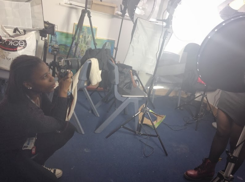
Here are a few shots that I have taken in order to meet my brief for my music magazine. The picture above is a sample for my double page spread and the picture below I had in mind at first for my front cover, but know I might use it for my contents page. The area in which I took these photos were the studio, in which I felt had very good lighting. Also it benefited my model as she needed to hold her heavy guitar, in which I had a chair for her to sit on. This also made it look more authentic, as you stereotypically play a guitar sitting down. This links to my brief as a lot of Indie Pop singers play an instrument, mainly a guitar. This connotes the Indie side a lot more. I decided to use dim lighting as I wanted my model to look timid as this is a convention an indie pop artist has through my research. I also tried out bright lighting as the bright lighting gave my model a bright light effect on her face which I did not like and wanted to change. Changing the bright light and turning the lights down a bit
As you can see from this picture above, I took another test shot of how I wanted my model to pose on the front cover. Unfortunately the shot did not turn out too well as there was bright lighting used on the test model I used face. This was not the effect I wanted to create. This is what therefore made me want to turn the lights down a bit more to have a clear view of my models face without bad lighting. This shot was also taken in the studio on white background which was what I wanted, it was only a shame about the lighting. The white back drop also made me have to work a lot better with the lighting as it could have given off bad effects several times which I did not want to happen. I therefore took a lot of shots at mid angle instead of low angles, as low angles could have created a shiny, bright effect on my models face as a ray of light could have shined through from the top of the picture.
Tuesday, 11 February 2014
Feedback For My Music Magazine (Incomplete)
Today, I asked for feedback for my music magazine at this current stage. The feedback given from my peer Sabrina Boukhalfa was ' The style of fonts need to change, that would look a lot more effective. Also I like the colours, but the page could be more crowded with writing, that would also look more effective. Other than that, I like it'.
Monday, 10 February 2014
Cover Layout/Photoshop
As you can see from above, as my model had a drawing on her hand I had to photoshop it to make it look like it wasn't there. This then helps me be a bit more closer to meeting my brief, as an indie pop personality is quite timid but still slightly rebellious.This is also the layout in which my magazine will look like, with various different writing round each side of the model.
Thursday, 6 February 2014
Experimenting With Photoshop (Using My Test Shots)
Today, I experimented with Photoshop using my test shot which I want to use on my front cover, but re-take the photo and sharpen it up a little. As you can see, my masthead covers part of her face which I do not want to happen. I now know that when re-taking the actual picture, I need to move the camera down more so the masthead is not in contact with her face. Also the lighting on her jumper needs to be changed and look a lot more fresh.
Wednesday, 5 February 2014
Feedback From Test Shots
I took many test shots for my front cover of my model. My teacher gave me great feedback suggesting that I re-invented this image above, but maybe moved it down a little bit and tweaked it more, making it a lot more sharp and focus. This will now help me a lot more so I know what shot I want and what will make my front cover look more authentic.
Tuesday, 4 February 2014
Test Shot Analysis
Today, I took some test shots of the model I want to use on my front cover. As I my model to do different poses, I took a lot of test shots at different angles to see which one I preferred more. To be honest, I preferred to do a mid shot rather than a long shot as I wanted more of a focus on the model so that readers can tell what genre my music magazine is. I used a bit of both, bright lighting and dim lighting as the lighting can relate to the indie pop genre, as most characteristics of the genre is timid, which could be connoted by the dim lighting. Aside from that the bright lighting could connote wildness and is quite quirky which also relates to the genre which I was going for. Having the studio for the mise-en-scene, I personally believed worked well as I knew how I wanted to place my model on photoshop and with the lighting not being too bright made me work with my model and photoshop a lot easier. Also I took a lot of high angle shots and low ones to create a sense of timid, but a quirky side to my model. This relates to the indie pop genre as most of the artists can be quite shy, but when they are on stage, their characteristics often change to bold and confident.
Sunday, 2 February 2014
Shot List
Here I have created my shot list for my music magazine. As you can see I will not be taking many shots of different objects as I want every page on my magazine to look similar to the front cover. This will allow readers to know what magazine they are reading without having to always refer back to the front cover to make sure that it is the magazine they are reading. This is beneficial in meeting my brief as the genre of music I have chosen to explore is a popular genre which I want to attract people into reading.
Artist Profile
Double Page Spread (Comparison)
My inspiration for my double page spread was taken from an Indie Pop magazine which I found online. I liked the fact that the girl on the left is holding a guitar which is relate-able to the genre I am focusing upon. Also even though the layout isn't complex, it is still interesting. This will help me meet my brief so that my magazine is an easy read to readers.
Contents Page (Comparison)
As similar to my front cover, I decided to gain some inspiration from 'Bliss' magazine for my contents page as the page is similar to its front cover which I want to have the same effect. I made my contents page look similar, but changed a little comparisons. This is beneficial as readers will know what magazine it belongs to.

Front Cover (Comparison)
My Inspiration for my music magazine front cover comes from Pop magazine 'Bliss'. My reasons for choosing to create a similar front cover, was that the front cover of the magazine is bold and the layout is attractive to a target audience between 13-19 which is my target audience. Even though the prices are different from each other, I gained other inspiration for the prices from another Indie Pop magazine which I've spoken about previously on my blog and is similar to the style of genre I want to look at, Indie Pop. 

Subscribe to:
Comments (Atom)


.jpg)
.png)
.png)
.png)


.png)


